Visual Statistics
Periodix-Planner provides powerful visual statistics to help you understand your time allocation and track your budget across all time periods.
📊 Overview
Visual statistics are displayed in the time budget code block within your notes, showing:
- Pie charts - Category distribution visualization
- Allocation tables - Detailed breakdown with hours and percentages
- Progress bars - Visual tracking of budget consumption
- Budget status - Color-coded indicators (green/yellow/red)
Note: These are in-note visualizations. For global analytics across all your periodic notes, see Statistics.
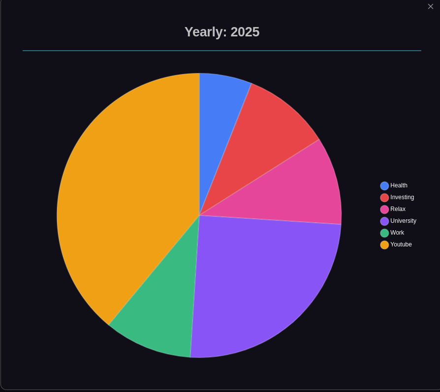
Pie Chart Visualization
The pie chart shows the distribution of allocated time across categories:
- Color-coded segments - Each category uses its configured color
- Percentage labels - See exact allocation percentages
- Interactive - Click to enlarge for detailed view
- Real-time updates - Reflects current allocations
Enlarged View
Click the pie chart to open an enlarged modal view with:
- Larger, more detailed visualization
- Better visibility of all categories
- Full screen viewing option
📋 Allocation Table
The allocation table provides detailed information:
Columns
- Category - Name and color indicator
- Allocated Hours - Total hours allocated
- Percentage - Percentage of total available hours
- Parent Budget - Status relative to parent period budget
- Child Allocated - Hours allocated in child periods (if applicable)
Sorting
Click column headers to sort by:
- Category name (alphabetical)
- Allocated hours (numerical)
- Parent budget status
- Child allocations
📈 Progress Tracking
Visual progress indicators show:
- Remaining hours - Hours still available
- Allocation percentage - How much of total is allocated
- Budget status - Visual feedback on budget health
🎨 Status Colors
- 🟢 Green - Within budget, healthy allocation
- 🟡 Yellow - Approaching limit (80-100% allocated)
- 🔴 Red - Over budget or over parent allocation
Related:
- Statistics - View global analytics across all periodic notes
- Categories - Learn about automatic category discovery
- Time Budgeting - Understand the time budgeting system
- Allocation Editor - Interactive time allocation management