Calendar View
The Calendar tab is the main scheduling interface for viewing and interacting with your events. It supports multiple view modes, a customizable toolbar, and a range of visual options.
View Modes
Prisma Calendar offers five view modes, switchable from the toolbar:
| View | Description |
|---|---|
Year (multiMonthYear) | Twelve months laid out in a compact grid. Events appear as compact chips with automatic "+more" overflow, color dots show event colors at the top of each day, and the palette matches your Obsidian theme. Click an event to open it, click a day to create one. Prev/Next step a year at a time. |
Month (dayGridMonth) | Full month grid with event chips. Color dots indicate events on each day. |
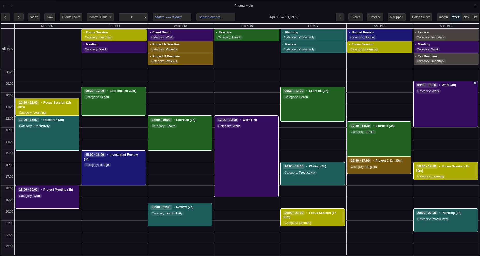
Week (timeGridWeek) | Seven-day time grid with hourly slots. Events display at their exact times. |
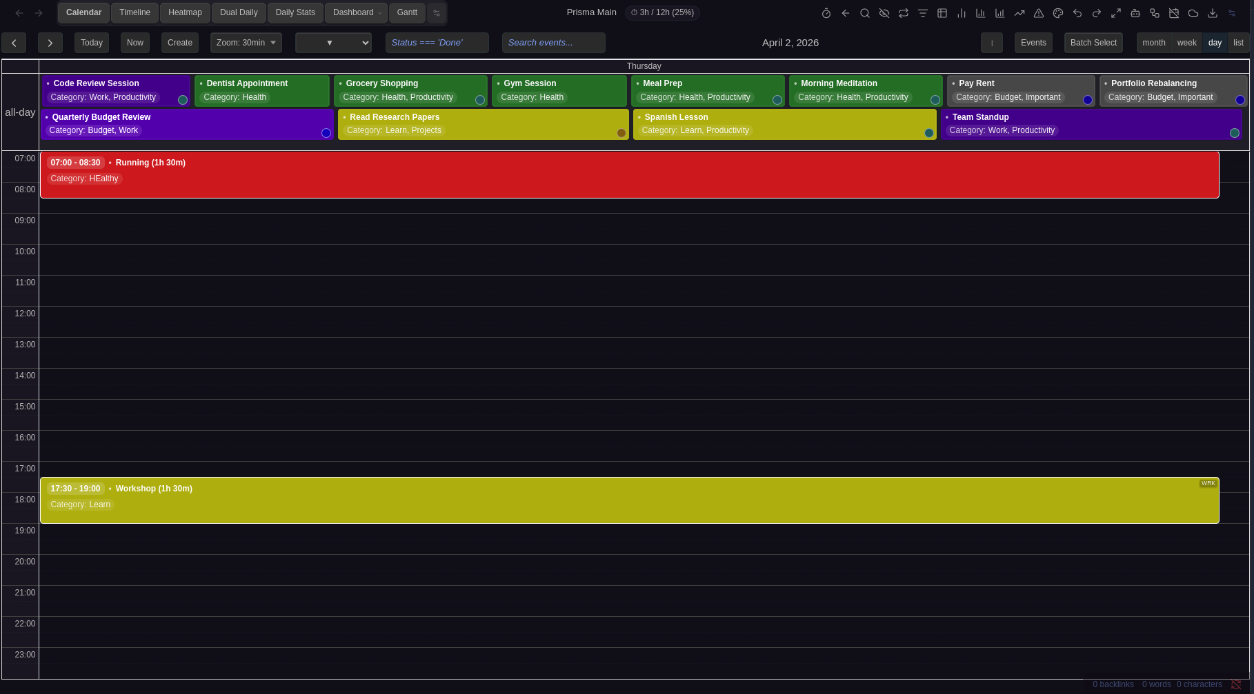
Day (timeGridDay) | Single-day time grid for detailed scheduling. |
List (listWeek) | Flat list of events for the current week, sorted chronologically. |
Configure the default view in Settings → Calendar → View Configuration → Default view.
Mobile View
Mobile devices (screen width ≤ 768px) can use a different default view, optimized for smaller screens. Configure in Settings → Calendar → View Configuration → Default mobile view.
Toolbar
The toolbar sits at the top of the calendar and provides quick access to navigation, event creation, filtering, and display controls. Each button can be individually shown or hidden in Settings → Configuration → Toolbar Buttons.
Navigation Buttons
| Button | Action |
|---|---|
| Left (◀) | Navigate to the previous period (previous year, month, week, or day depending on current view) |
| Right (▶) | Navigate to the next period |
| Today | Jump to today's date |
| Now | Scroll to the current time in day and week views. In year and month views, scrolls to today's cell. Not available in list view. |
Event Creation
| Button | Action |
|---|---|
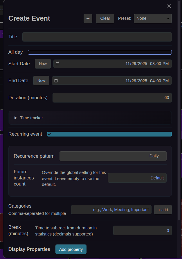
| Create Event | Opens the Create Event modal. You can also create events by clicking or dragging on empty calendar space. |
Zoom Level
| Button | Action |
|---|---|
| Zoom Level | Displays the current time slot duration (e.g., "10m"). Click to cycle through zoom levels, or use CTRL+scroll to zoom in and out. |
Zoom controls the granularity of time slots in day and week views. The default zoom levels are 1, 2, 3, 5, 10, 15, 20, 30, 45, 60 minutes, configurable in Settings → Calendar → Time Display → Zoom levels. The viewport stays centered on the same time when zooming.
Filtering
| Button | Action |
|---|---|
| Search Input | Text field for filtering events by title. Case-insensitive. Press Enter or blur to apply. |
| Expression Filter | Text field for property-based filtering using JavaScript expressions (e.g., Status !== 'Done'). |
| Filter Presets (▼) | Dropdown to apply saved filter expressions with one click. Select "Clear" to remove the active filter. |
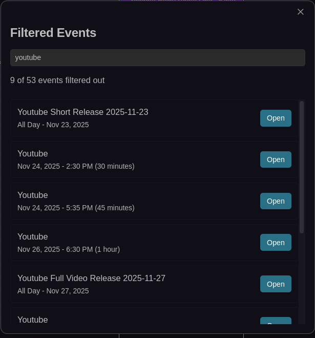
See Filtering for full documentation on search, expressions, and presets.
Other Toolbar Buttons
| Button | Action |
|---|---|
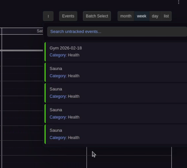
| Untracked Events | Opens a dropdown showing events without date properties. See Untracked Events. |
Untracked Events Menu
Reopen the calendar view for toolbar changes to take effect.
Time Display
Configure the visible time range and slot behavior in Settings → Calendar → Time Display:
- Day start / end hour: Visible time range in day and week grids (default: 7:00–23:00)
- Slot duration (minutes): Height of each grid slot (default: 30 minutes, range: 1–60)
- Snap duration (minutes): Drag and resize snapping interval (default: 30 minutes, range: 1–60)
- Zoom levels (minutes): Comma-separated list for CTRL+scroll zoom (default:
1, 2, 3, 5, 10, 15, 20, 30, 45, 60)
Visual Appearance
Display Density
Two density modes control event spacing:
- Comfortable (default): Standard spacing between events
- Compact: Reduced spacing for more events on screen
Configure in Settings → Calendar → Visual Appearance → Display density.
Event Text Coloring
The calendar automatically adjusts event text color based on the event's background color for readability:
- Default event text color: Used on events with dark backgrounds (default: white)
- Alternative event text color: Used on events with light or white backgrounds (default: black)
The detection is automatic — the calendar evaluates the background luminance and picks the appropriate text color.
Configure both in Settings → Calendar → Visual Appearance.
Other Visual Options
- All-day event columns: In the daily view, multiple all-day events sit side by side when there is enough horizontal space, with width proportional to content. Events wrap to new rows when they don't fit
- All-day event height: Maximum pixel height for all-day events before they scroll internally (30–500px, default: 75px)
- Past event contrast: Dims past events (0% = invisible, 100% = normal, default: 70%)
- Show color dots: Color indicator dots in month and year view cells (enabled by default)
- Thicker hour lines: Bolder full-hour dividers in day/week views (enabled by default)
- Show duration in event title: Appends duration in parentheses after the title for timed events, e.g., "Meeting (2h 30m)" (enabled by default)
- Show decimal hours: Displays durations as decimal hours (e.g., 2.5h) instead of formatted (e.g., 2h 30m)
- Day cell coloring: Configurable gradient background for day cells, with optional month boundary mode. See Day Cell Coloring below.
Day Cell Coloring
The Day cell coloring dropdown controls the background coloring of day cells in the calendar. There are three modes:
Off (default)
No custom background is applied to day cells. The calendar uses its default appearance.
Uniform
All day cells receive a single gradient background using the Day background color picker that appears below the dropdown. This gives the entire calendar a consistent tinted look. Pick any color — the calendar applies it as a subtle gradient overlay on every cell.
Month boundary
Day cells alternate between two gradient colors based on their month, using the Even month color and Odd month color pickers that appear below the dropdown:
- Even month color — applied to January, March, May, July, September, November
- Odd month color — applied to February, April, June, August, October, December
Since adjacent months always have different parity, this creates a clear visual boundary wherever one month ends and the next begins — useful in week views that span two months or in month views that show overflow days from neighboring months.
Behavior details
- Colors are applied as gradient overlays, so they blend naturally with your theme's background.
- Today highlighting and hover states are preserved and take priority over the coloring.
- Out-of-month overflow days (the faded days in month view) use a slightly stronger tint for additional contrast.
- Changes take effect immediately — no need to reopen the calendar.
Configure in Settings → Calendar → Visual Appearance → Day cell coloring.
Sticky Headers
Sticky headers keep context visible while scrolling in day and week views:
- Sticky day headers: Pins the day/date column headers at the top of the viewport
- Sticky all-day events: Pins the all-day event section below the day headers (or at the top if day headers are not sticky)
When both are enabled, the all-day section sticks directly below the day headers with no gap.
These options only affect day and week views where vertical scrolling occurs. Month and list views are not affected.
Configure in Settings → Calendar → Visual Appearance.
Event Interaction
- Enable event preview: Hover previews inside the calendar (enabled by default)
- Event hover tooltips: Displays event name with time/duration, file path, frontmatter properties, and the first three lines of note content
- Show current time indicator: Red time line in day/week views (enabled by default)
- Highlight upcoming event: Highlights the next upcoming event (enabled by default)
- Skip underscore properties: Hides properties starting with
_from event chips (enabled by default)
Configure in Settings → Calendar → Event Interaction.
Event Overlap
Control how events display when they share the same time:
- Allow event overlap: allow events with overlapping times to render on top of each other. When disabled, overlapping events render side-by-side in columns (like Google Calendar). Applies to all calendar views (default: enabled)
- Allow slot event overlap: in week/day time-grid views, allow events that share the exact same time-slot boundaries to render on top of each other. When disabled, events with identical start/end times are placed in separate columns within the slot. Has no effect when event overlap is disabled (default: enabled)
- Event stack limit: Maximum events to stack before showing "+more" link (1–10, default: 1)
- Desktop max events per day: Maximum events per day on desktop before "+more" (0–10, 0 = unlimited, default: 0)
- Mobile max events per day: Maximum events per day on mobile before "+more" (0–10, default: 4)
Configure in Settings → Calendar → Event Overlap.
Hide Weekends
Toggle Saturday and Sunday visibility in Settings → Calendar → View Configuration → Hide weekends.
First Day of Week
Set which day starts the week (0 = Sunday, 1 = Monday, etc.) in Settings → Calendar → View Configuration → First day of week.
See Also
- Configuration for the full settings reference
- Filtering for search, expression filters, and filter presets
- Color Rules for event background coloring
- Hotkeys for keyboard shortcuts in the calendar view
- Batch Operations for multi-select mode