Tooltips
Hover over nodes to see frontmatter properties instantly.
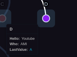
Hover tooltip showing configured properties
Usage
Show: Hover over node for 1 second
Hide: Move mouse away
Toggle: Settings → Show node tooltips, or assign hotkey to "Toggle Tooltips"
Disabled in zoom mode: Prevents overlap with zoom preview
Content
Displays:
- Node title (file name)
- Properties configured in Display Properties in Nodes setting
- Wiki links (clickable)
- Arrays (formatted as lists)
- Objects (nested display)
Respects: Property display settings
- Hide empty properties
- Hide underscore properties
Clickable Links
Wiki links: Navigate to linked node, tooltip updates
External links: Open in browser
Tip: Chain-navigate through multiple tooltips without clicking nodes!
Configuration
Tooltip width and property display settings are configured in Settings.
Positioning
Auto-positions to stay visible:
- Default: Above and right of node
- Flips to left if near right edge
- Flips below if near top edge
Next Steps
- Zoom Mode — Full inline preview (alternative to tooltips)
- Context Menus — Right-click actions
- Color Rules — Visual categories
- Configuration — Tooltip width and property visibility